Case Study
How I created a scalable, cross-channel visual language for Dose.
Dose operates in a crowded wellness category where clarity is often lost in noise. The opportunity wasn’t simply to make the brand look good, it was to make it behave consistently across every touchpoint, and allow for the visual language system to create space for scale.
It was a structural exercise in building a visual language system that could flex across CPG, digital, paid media, retail, and social without diluting the core idea. The goal was restraint with purpose. Minimal, intentional, emotionally grounded. A system that felt soft and approachable, yet disciplined enough to scale.
The Ask: Create a unified visual language that could perform across all channels.
-
Read Time
10 minutes
-
Scope
Omni-Chanel
-
Role
Creative Director
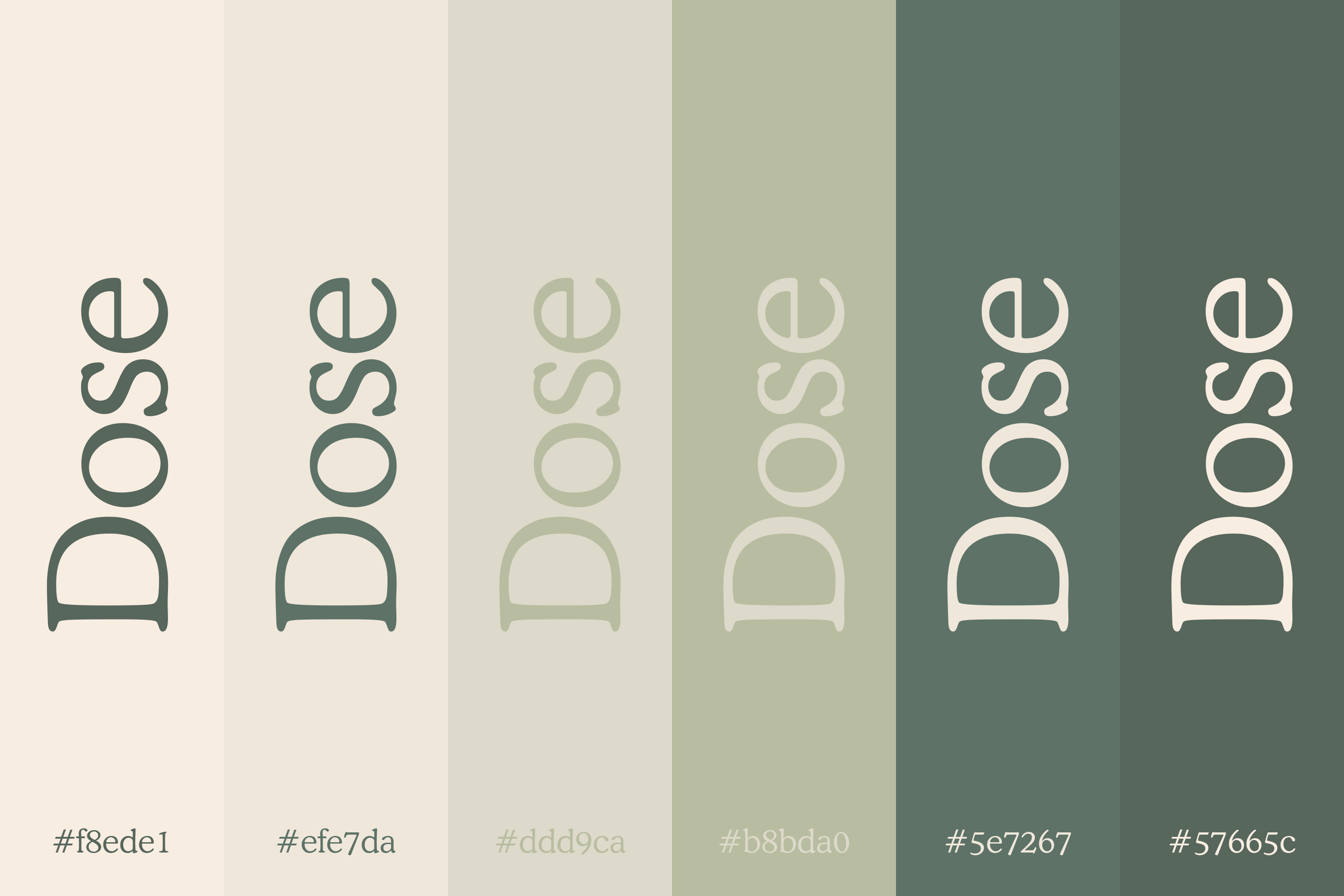
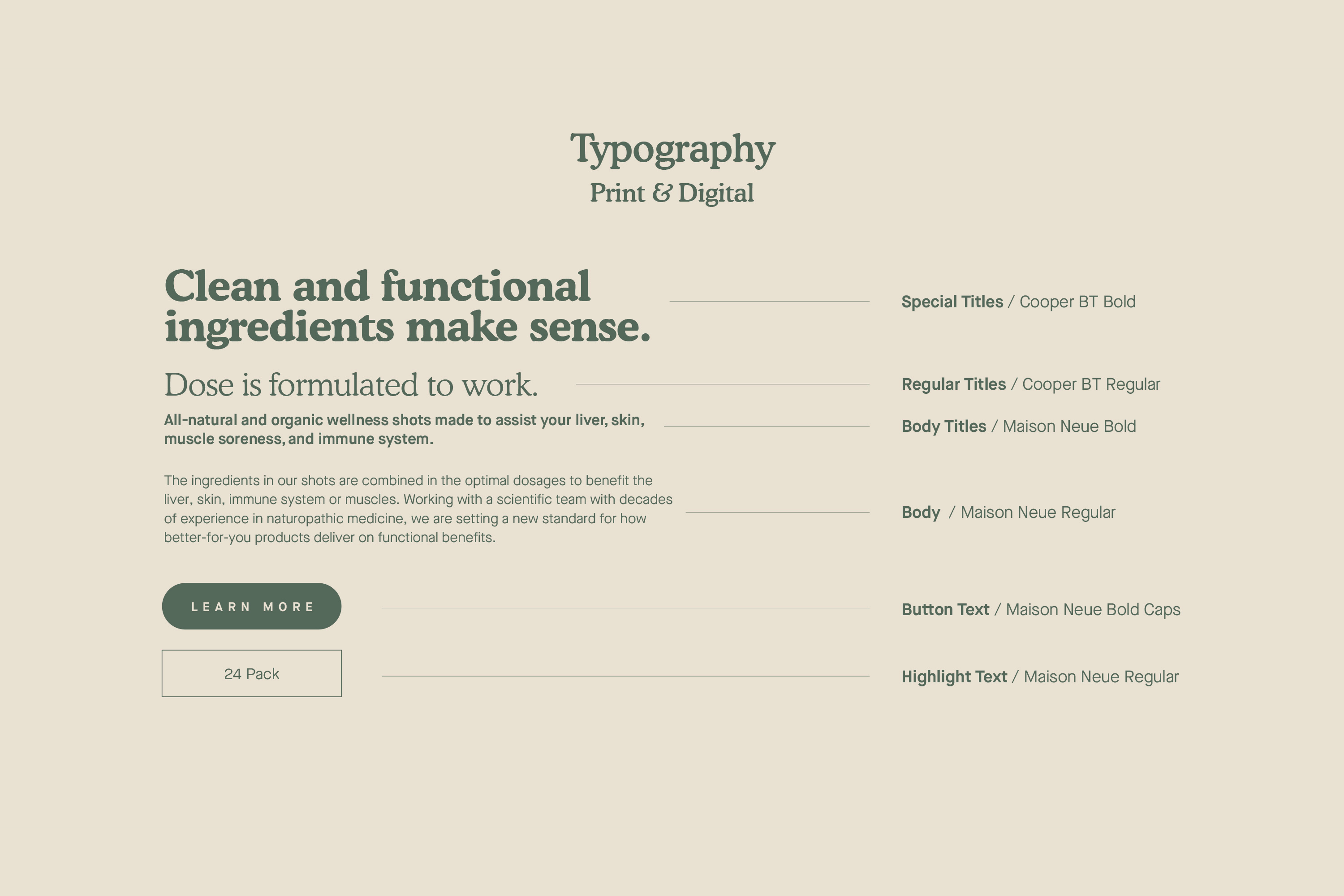
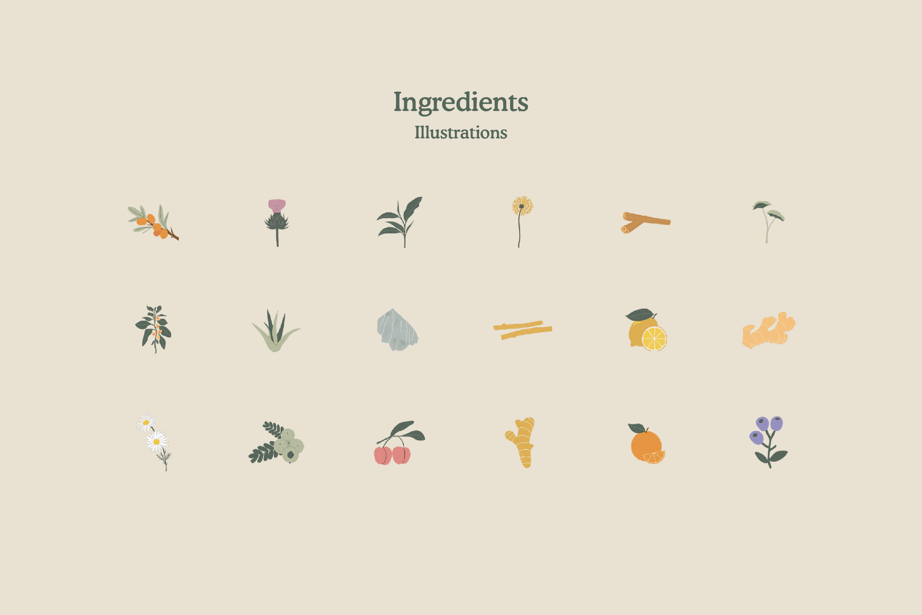
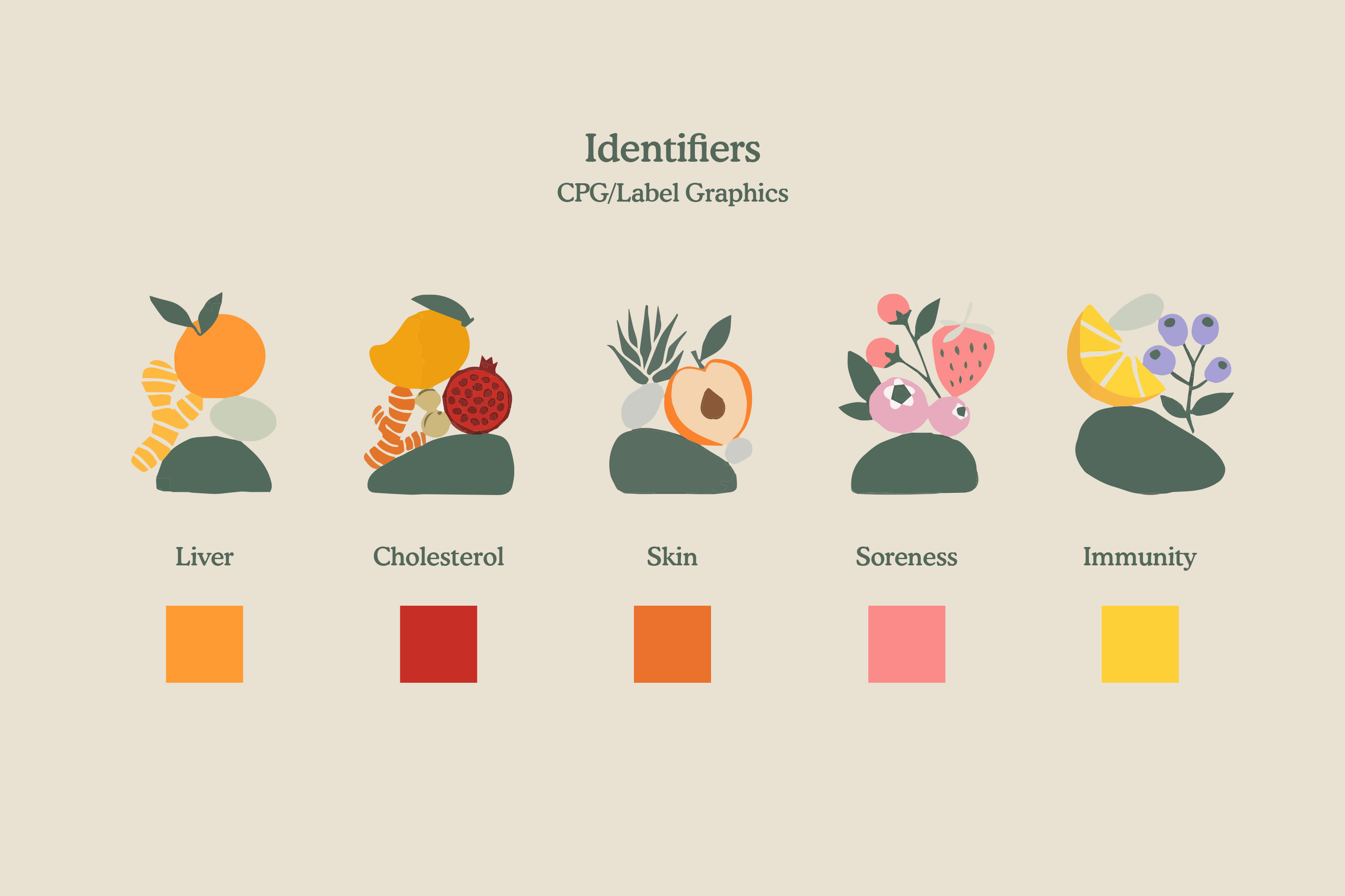
Rather than relying on decoration only, the brand identity was anchored in a somewhat controlled typographic hierarchy, a muted but confident color palette, and a proprietary illustration language rooted in organic ingredients and function.
Every design decision served two objectives:
- Clarify the product’s purpose instantly.
- Create repeatable frameworks for future execution.
The result was not just a look, it was simplified modular system. A framework that could extend from packaging to paid ads to UGC without reinventing itself each time.
A quirky, soft-sell, and palatable minimalistic brand design.
Corporate Identity.
The foundational system was built to hold its shape across physical applications as well within the confines of stationery, sales materials, retail touchpoints, and apparel.
The identity was intentionally minimal. Negative space was treated as a design tool. Typography carried authority without feeling clinical. Illustration added warmth without clutter.
By establishing disciplined layout rules and visual guardrails early, we ensured the brand could scale without creative drift. This is the advantage of systems thinking: creative expansion without aesthetic compromise for growth teams.
CPG.
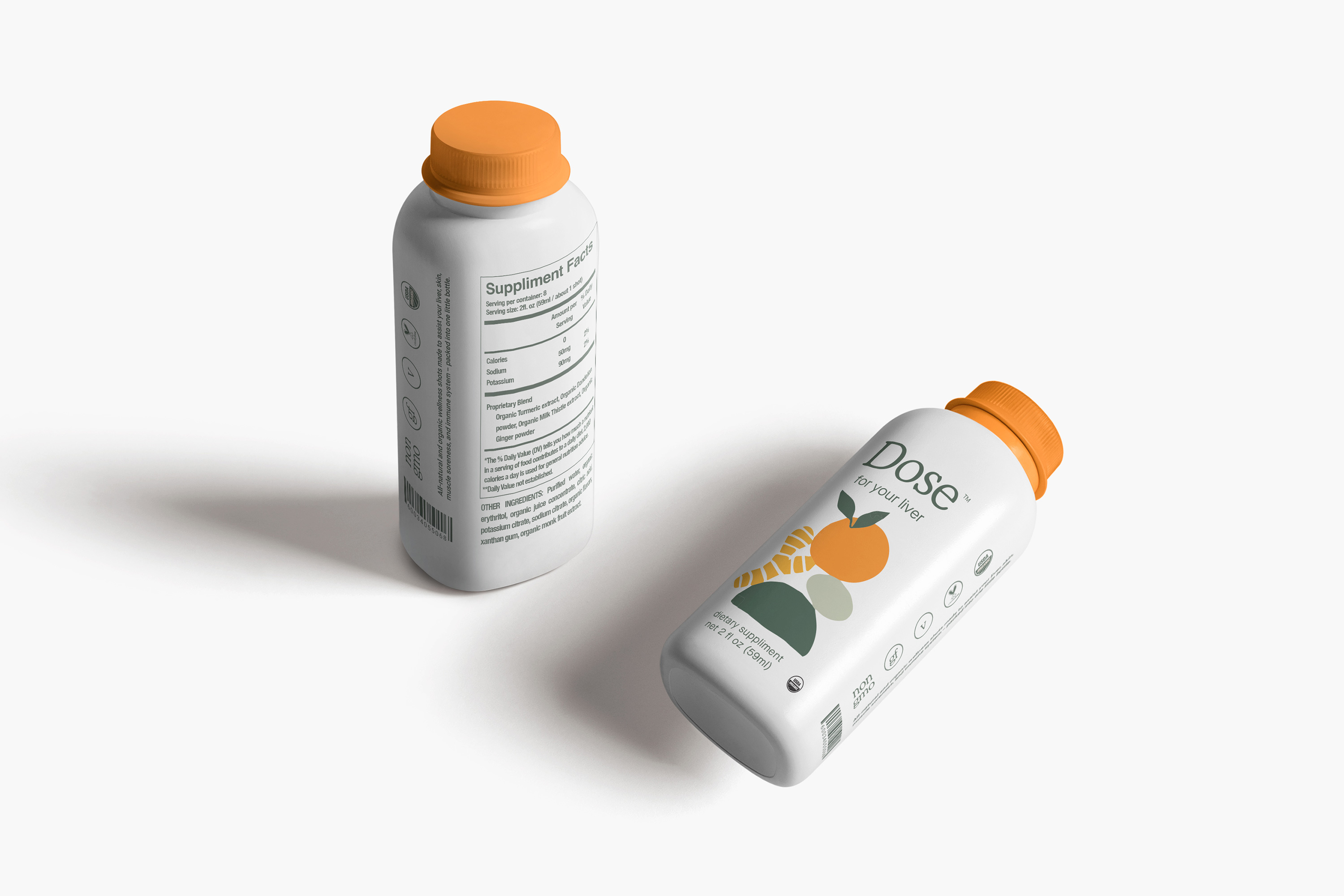
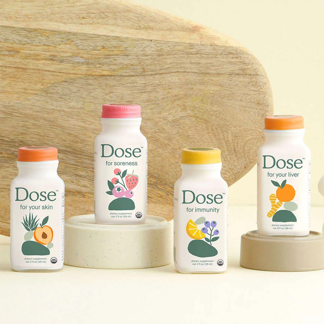
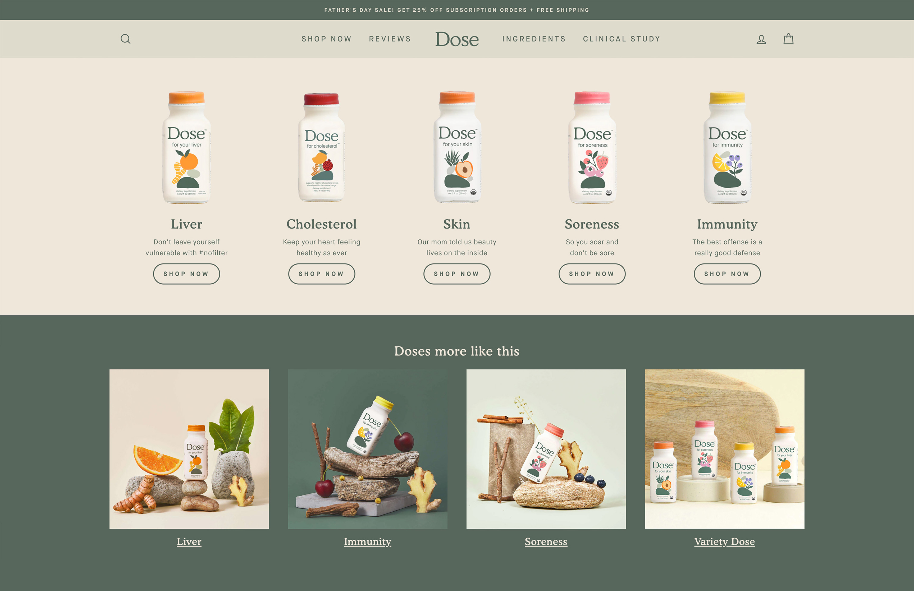
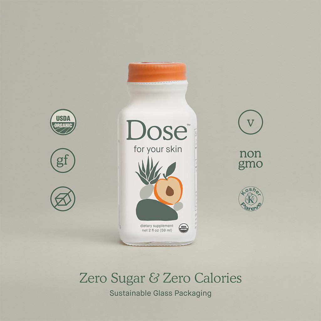
In wellness, packaging is often overloaded with claims. For Dose, we chose the opposite.
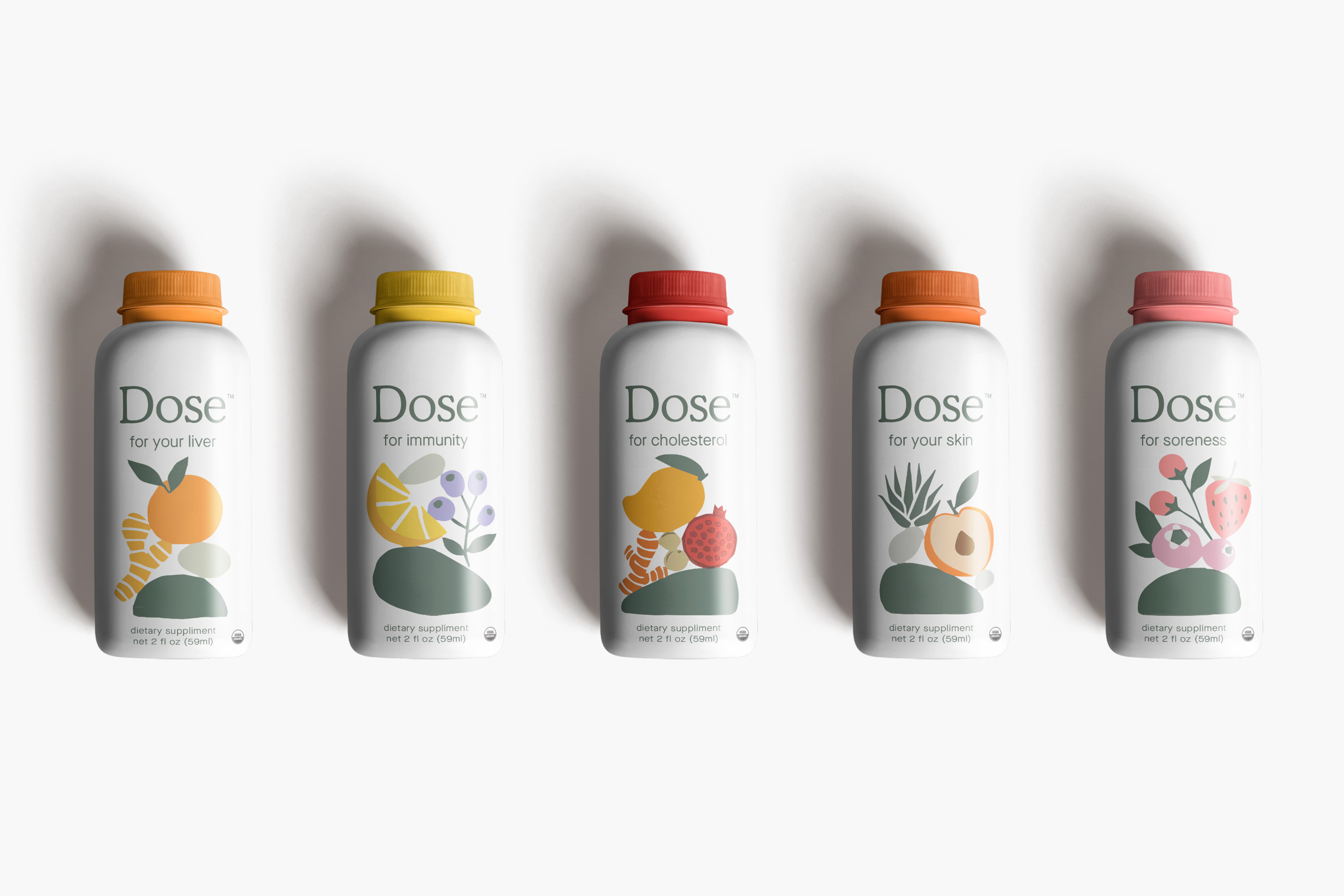
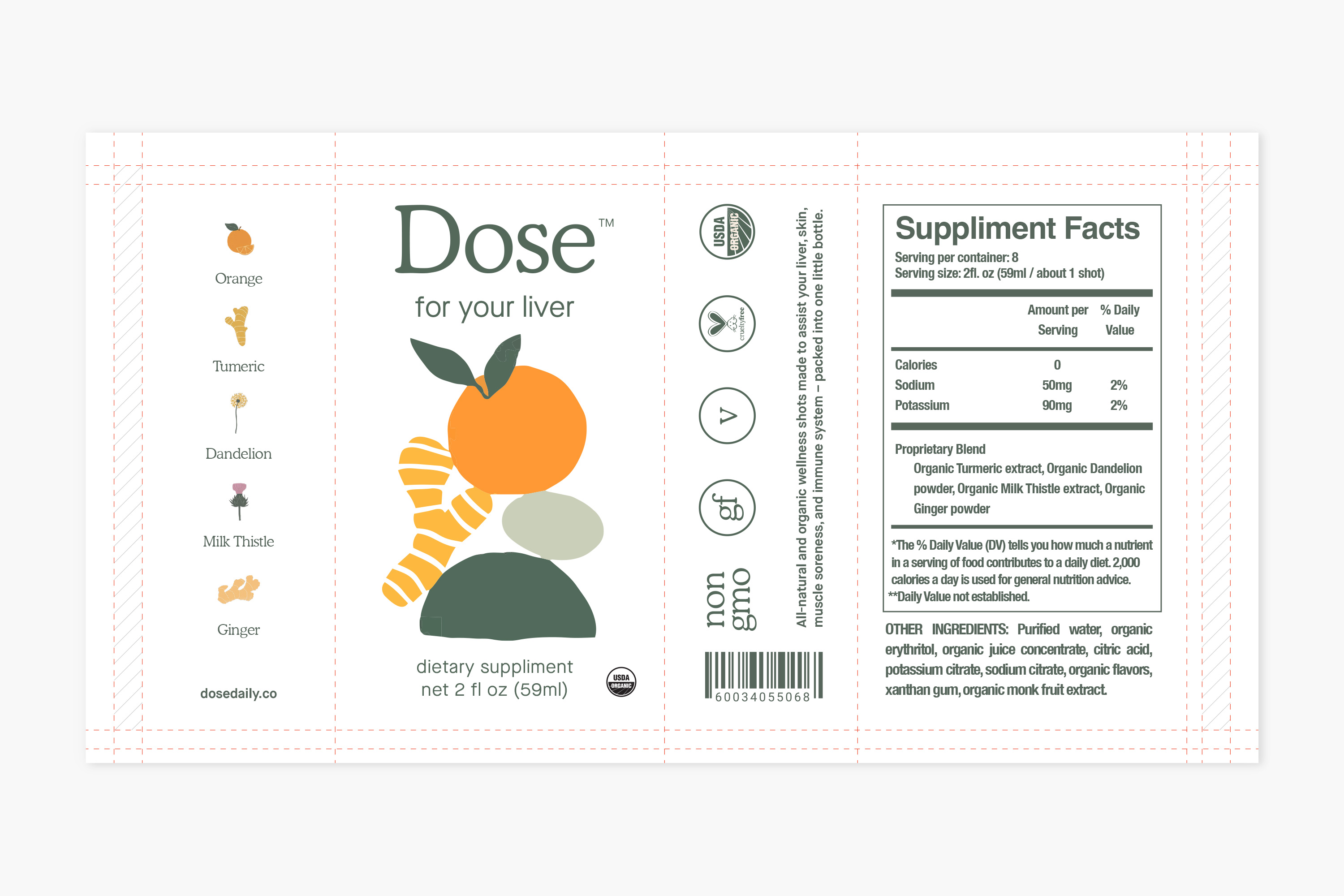
The CPG system was built around clarity, hierarchy, and trust. Each SKU used the same structural grid, illustration placement logic, and restrained color differentiation. Ingredient storytelling became visual rather than verbose.
This created three strategic benefits:
• Immediate shelf recognition.
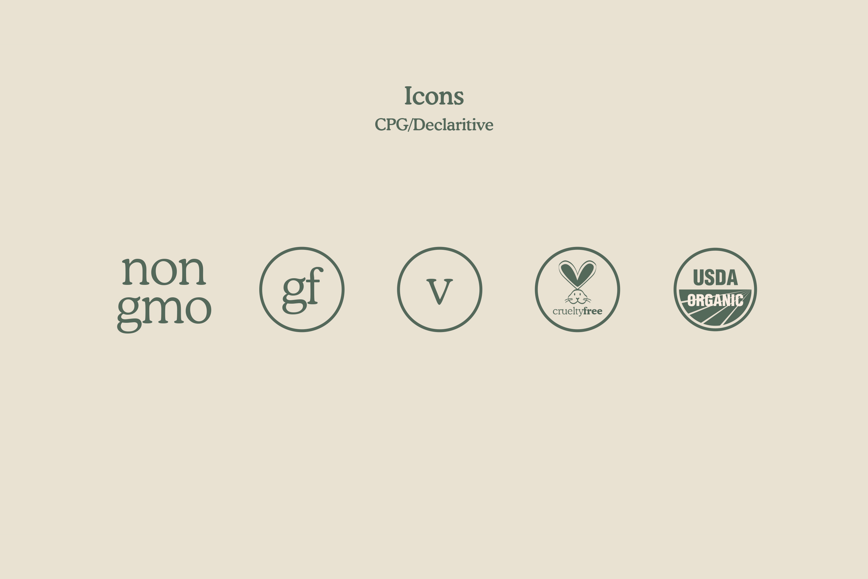
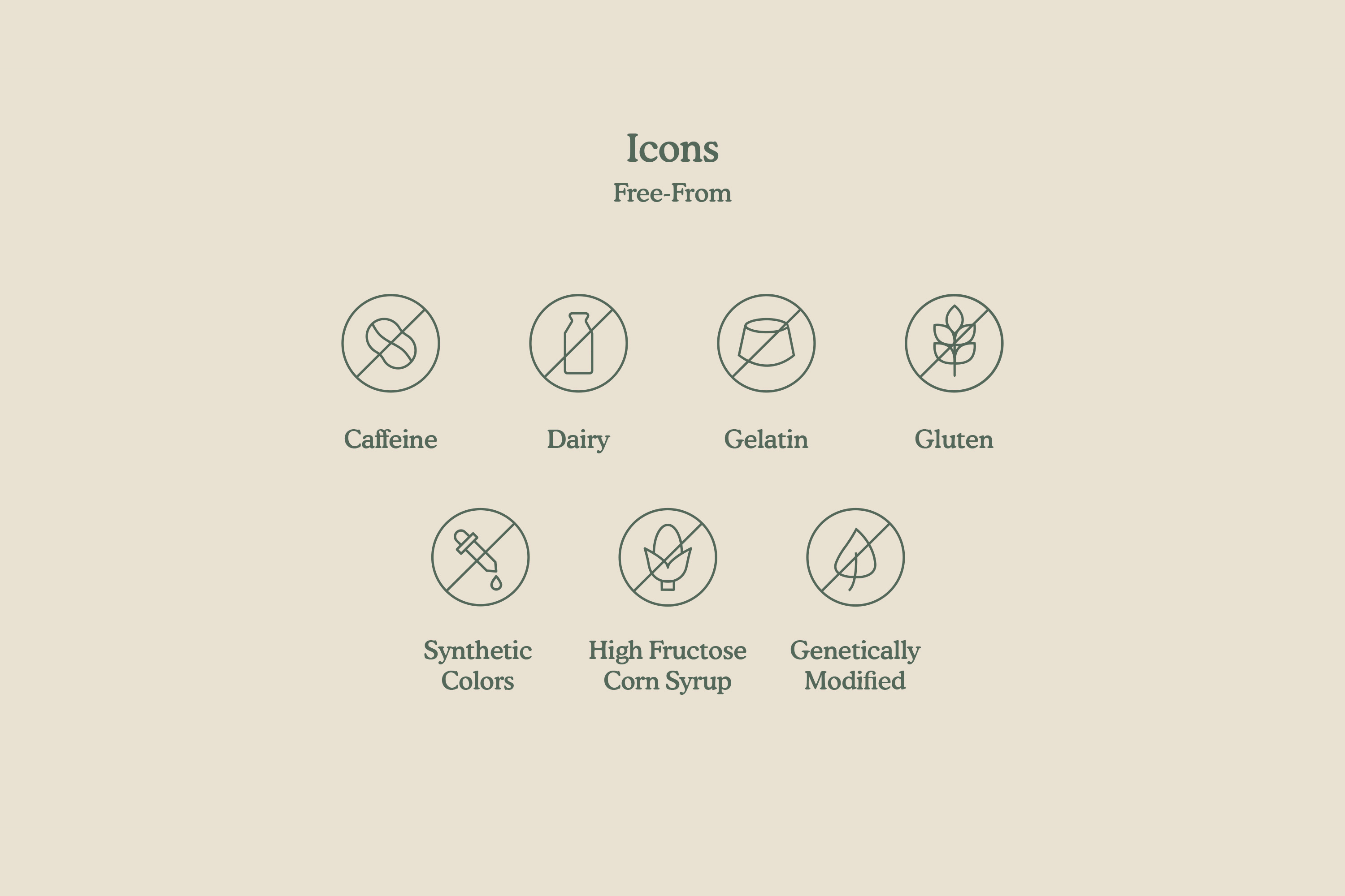
• Compliance without sacrificing brand personality.
• A packaging architecture that could scale as the line expanded.
The system communicates health without shouting it.
Video promos.
Wellness brands often default to either hyper-clinical messaging or exaggerated lifestyle fantasy. Dose required a more balanced tone. Video content was developed within the same visual guardrails as the static system. Composition, pacing, color temperature, and typography were aligned with the broader brand language.

- Title: "Dose Explainer"
- Time: 00:00:40
- Airdate: 03/20/2023
Rather than producing one-off advertisements, we built a repeatable narrative framework:
- Clear problem-to-solution storytelling.
- Ingredient-led visuals.
- Calm, grounded delivery.
Each execution felt distinct, but never disconnected from the system.
Photography.
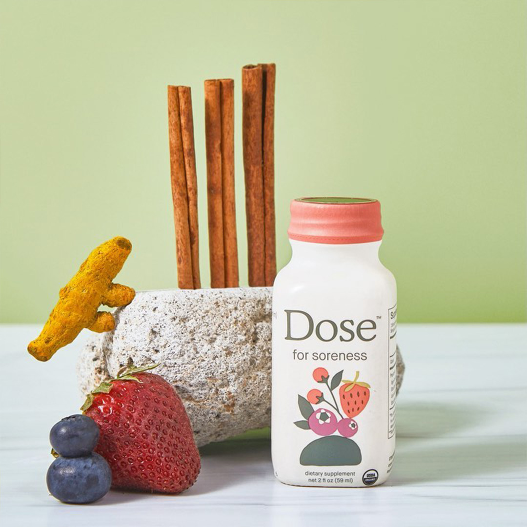
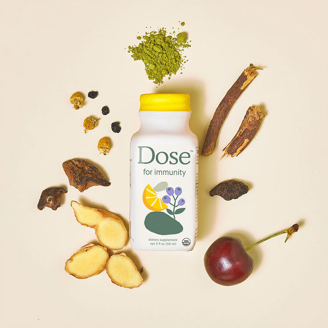
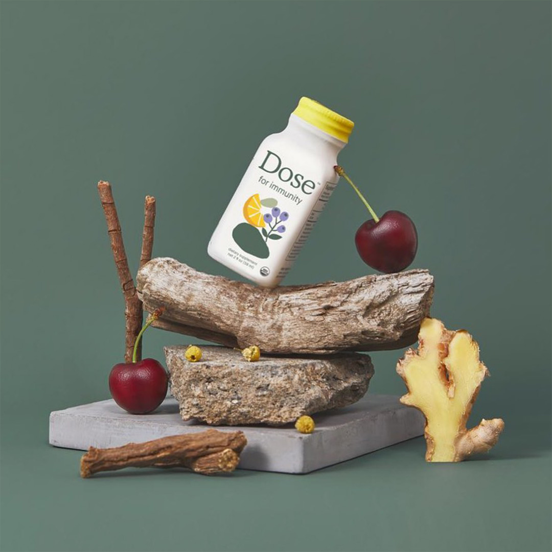
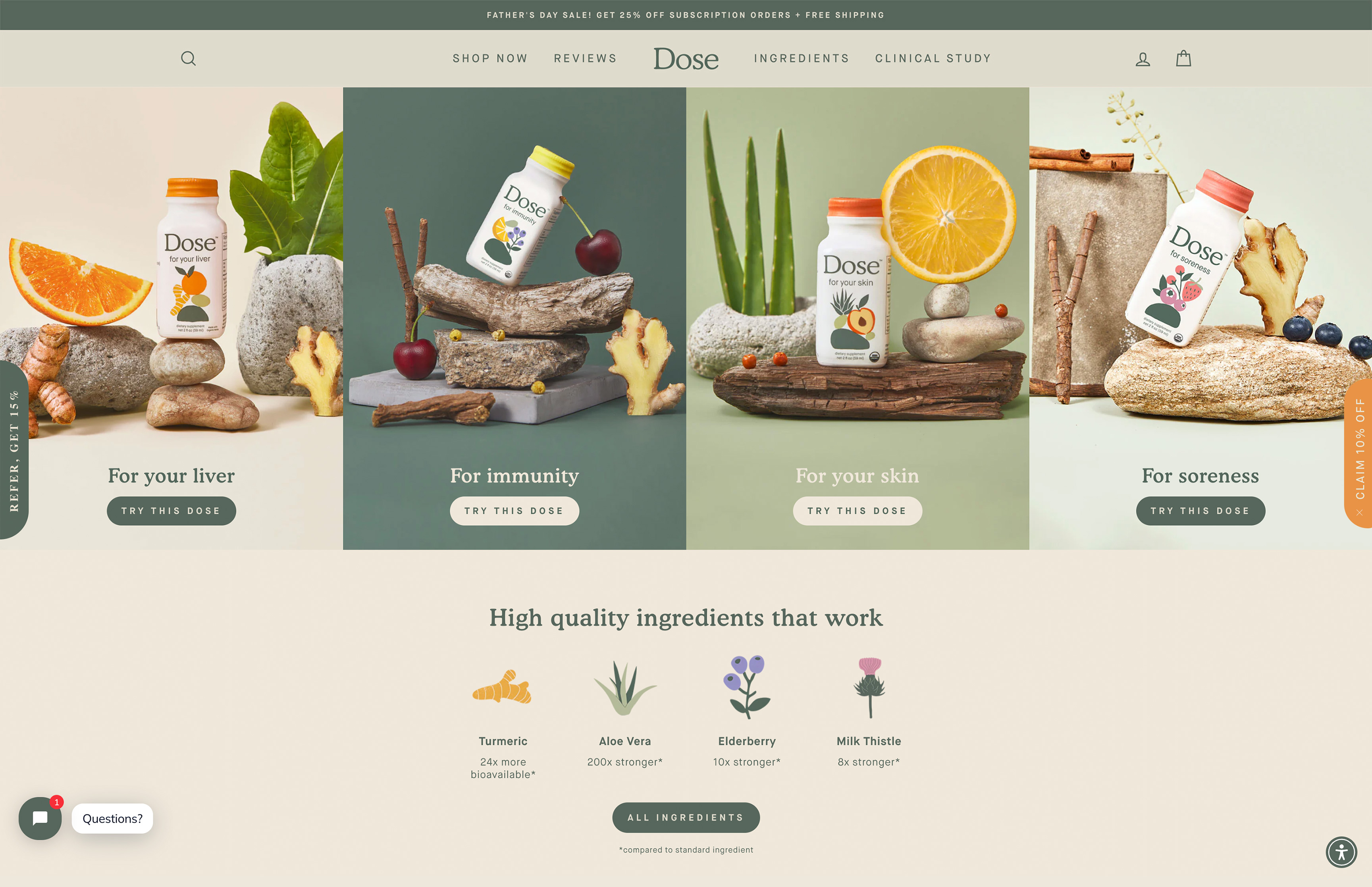
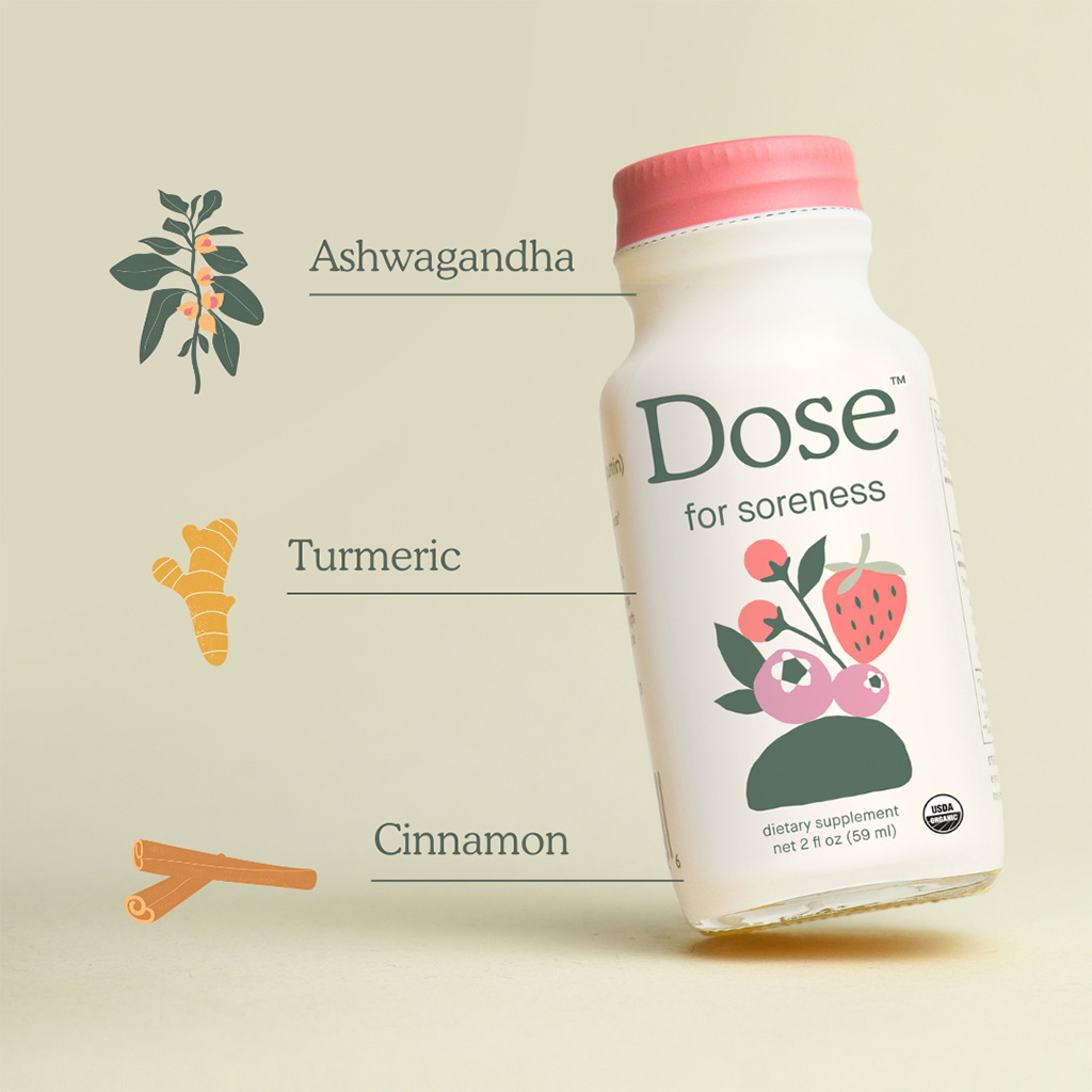
Photography wasn’t treated as an afterthought — it was a critical layer of the visual language model. Each product scene was built around ingredient storytelling and compositional restraint.
Importantly, photography adhered to the same system logic:
- Consistent backgrounds
- Intentional negativespace
- Ingredient hierarchy supporting the SKU’s function.
The result was a library of assets that could be deployed across ecommerce, paid media, and social without re-art direction every time.
Sculptural forms, soft natural light, related b-roll objects and controlled color environments were used to allow the product to feel elevated yet accessible.
Interactive layer.
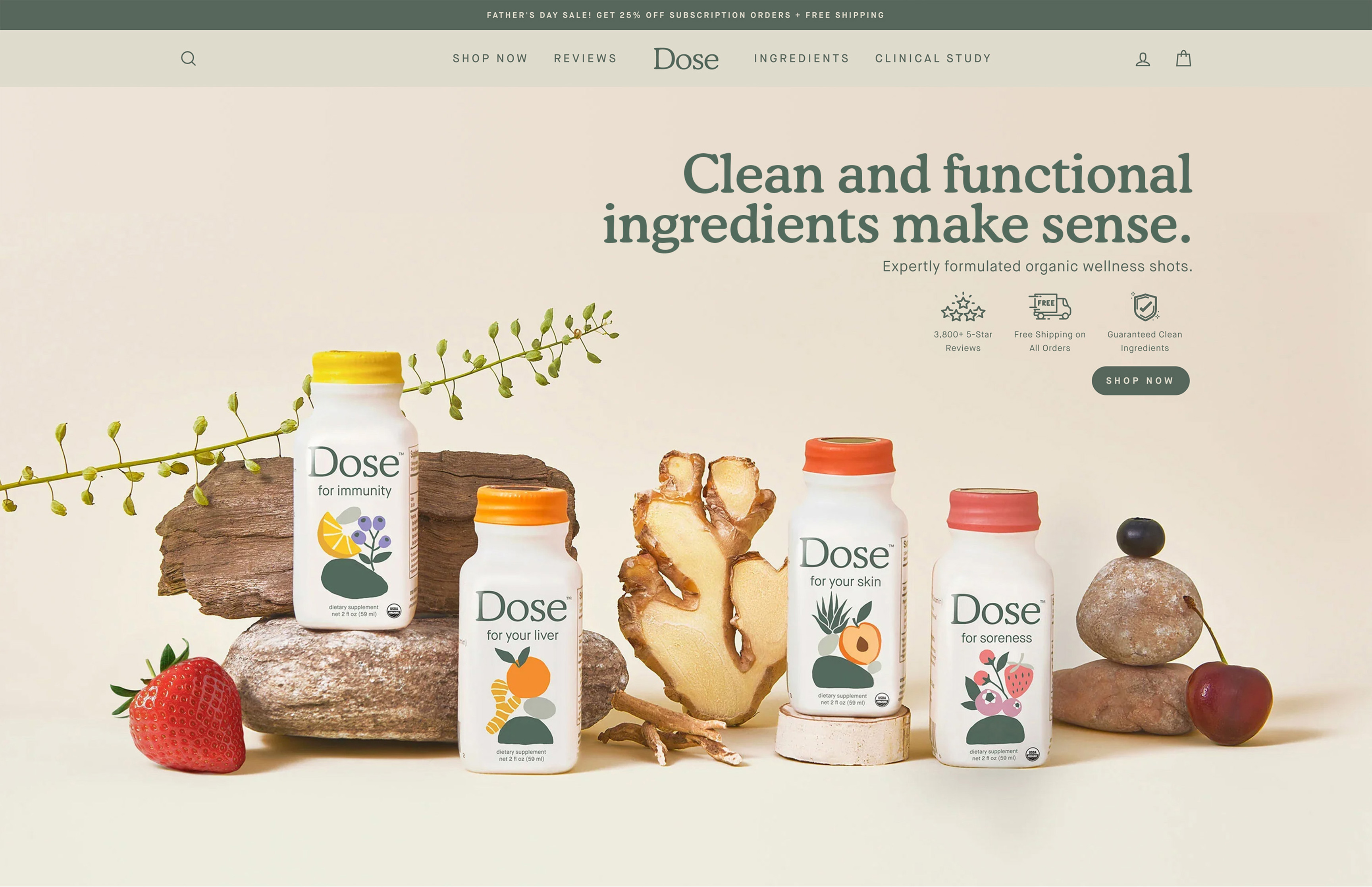
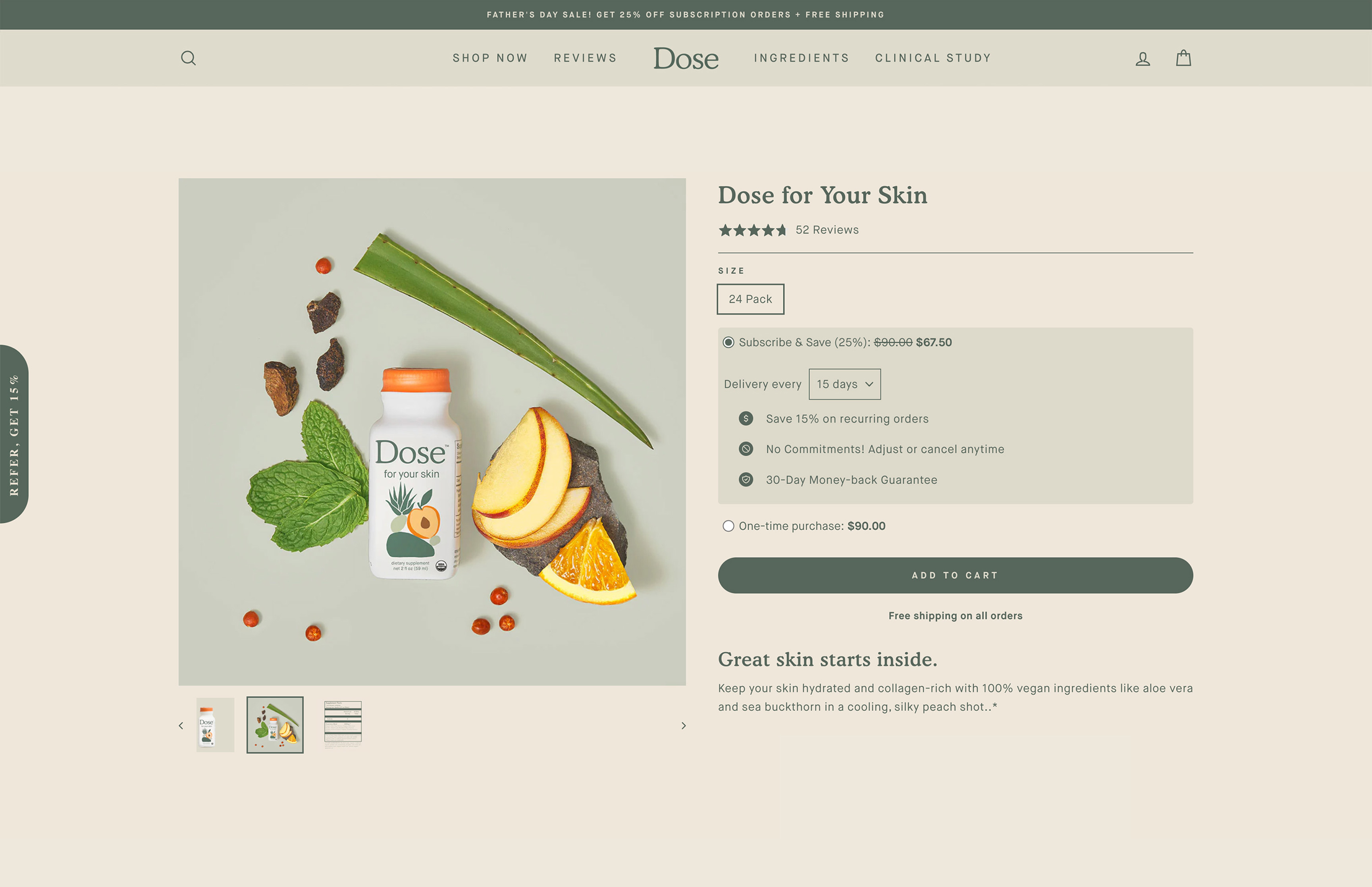
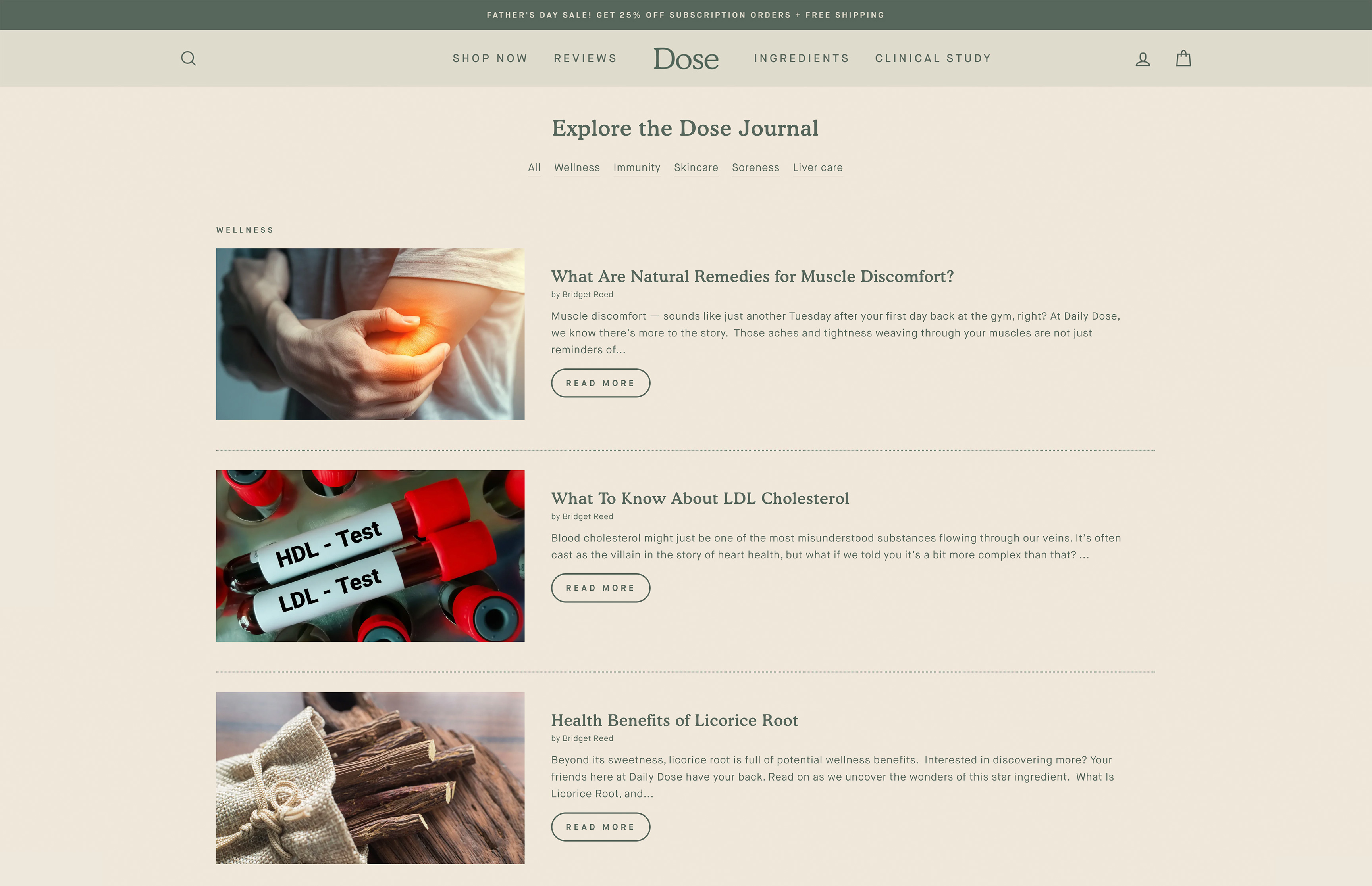
The ecommerce experience carried the system forward with discipline.
Subscription-first UX flows, clear hierarchy, and modular content blocks ensured the site felt as clean and functional as the product itself. The same typographic scale, color logic, and illustration style applied digitally.
Consistency across web and packaging created cognitive ease — reducing friction in both navigation and purchase decisions. Systems reduce decision fatigue. That’s as true for customers as it is for internal teams.
OOH.
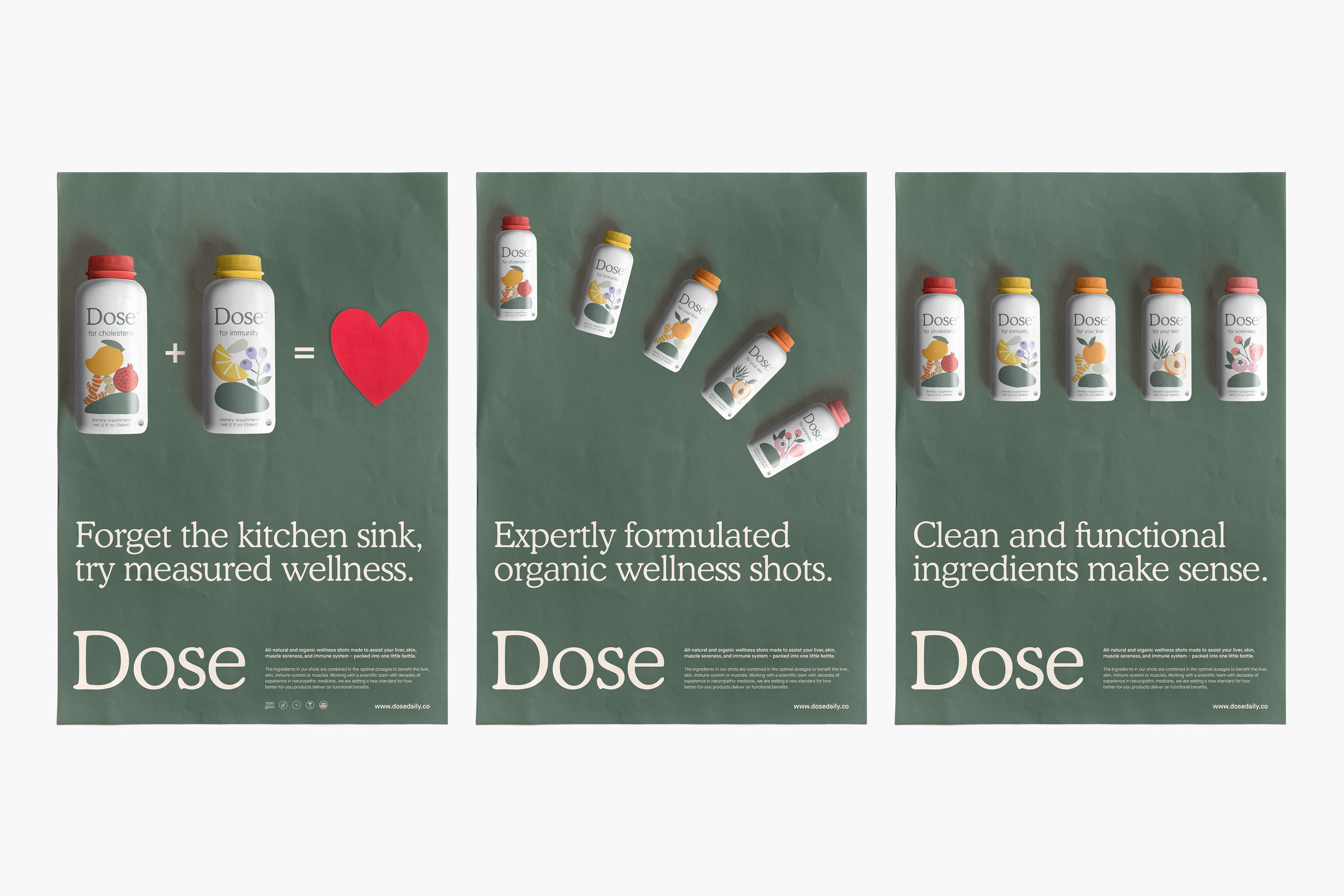
Out-of-home and retail posters translated the system into bold, simplified storytelling.
Minimal layouts, confident headlines, and ingredient-led visuals ensured that even at a distance, the brand felt coherent and recognizable. The key was reduction — not addition. Because the system was already defined, OOH became an extension of the framework, not a separate creative exercise.
Social.
Static Content / Paid & Organic
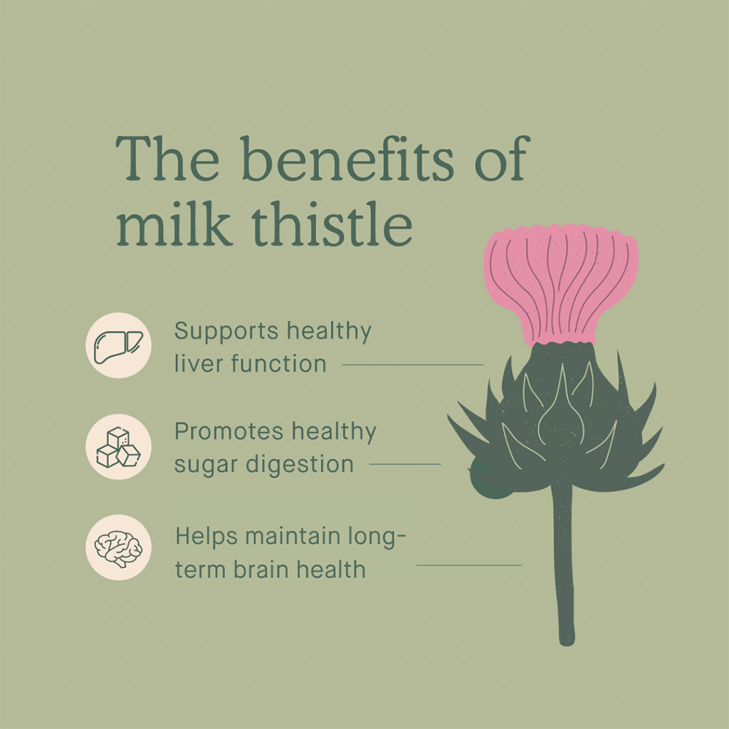
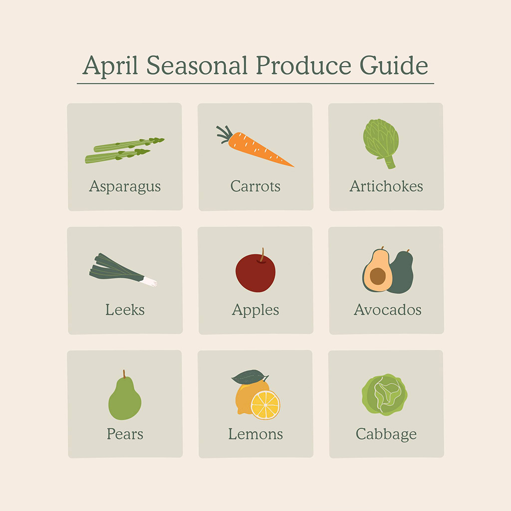
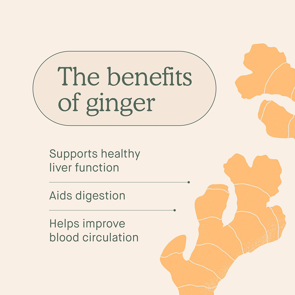
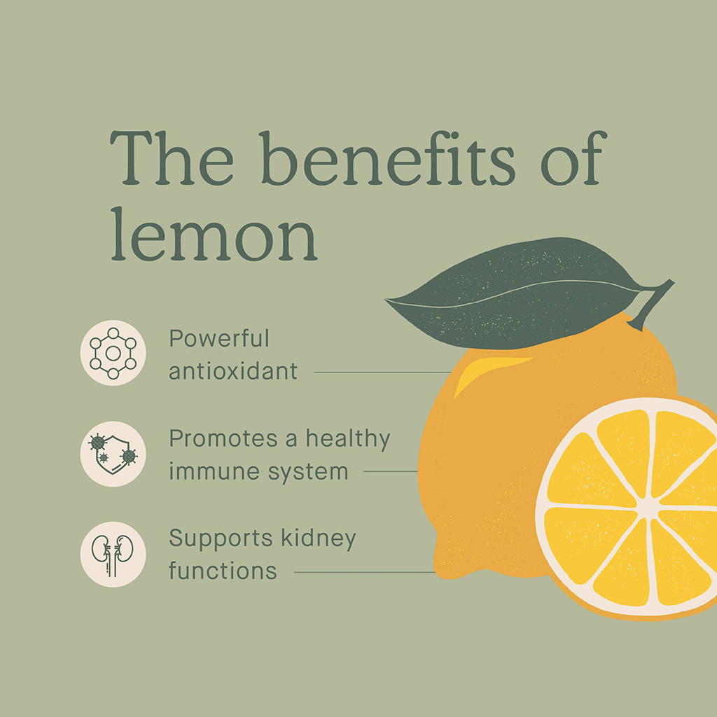
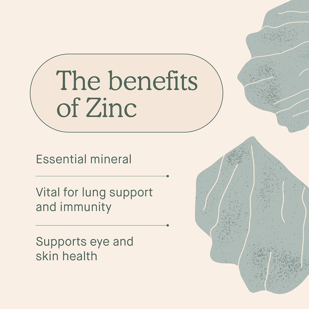
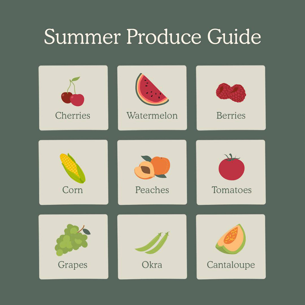
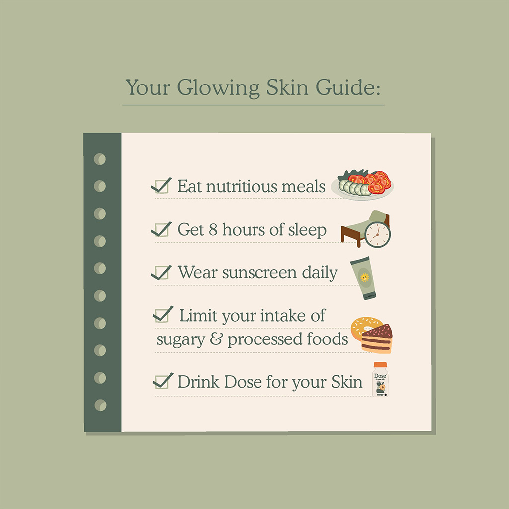
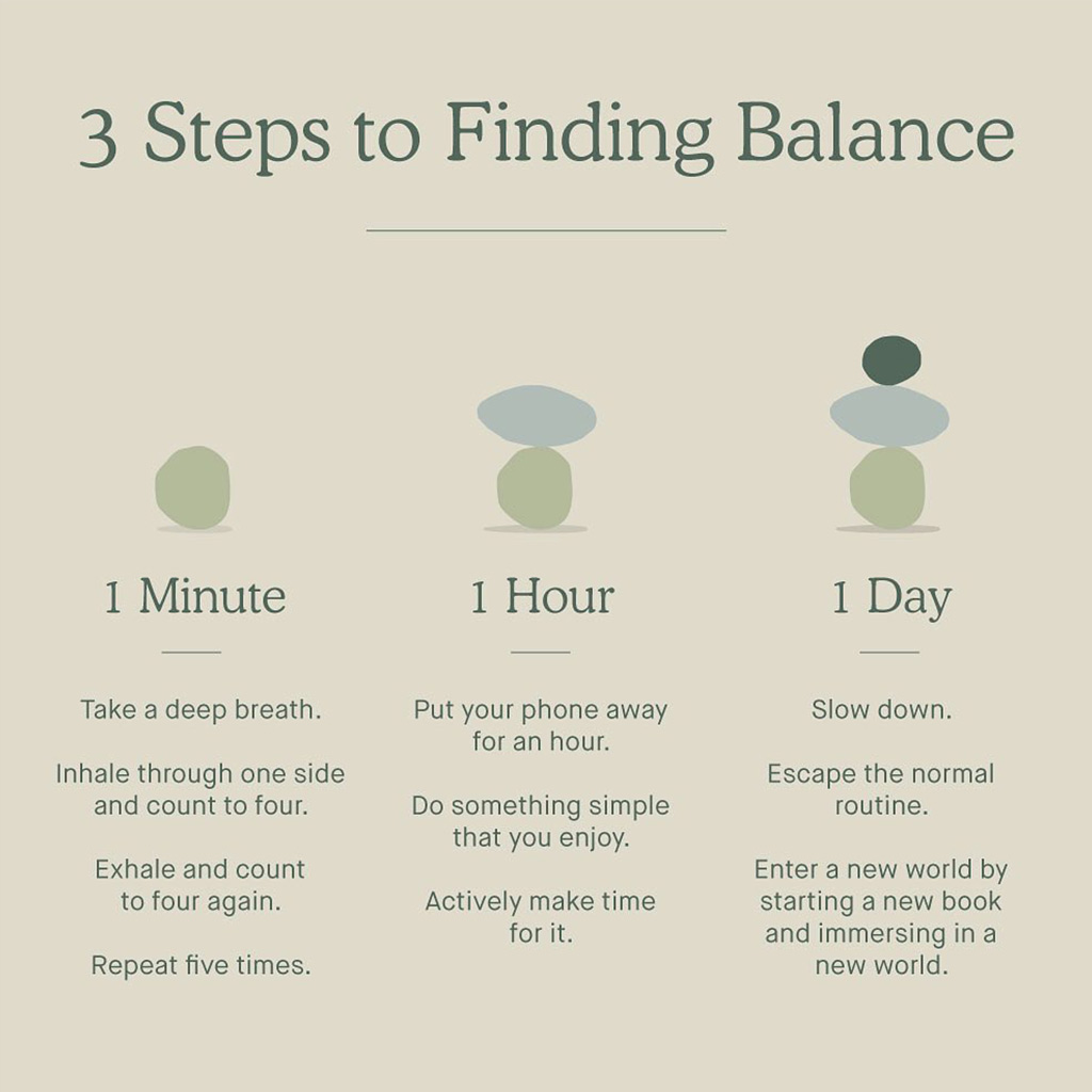
While the core of the brand is intentionally minimal and soft, a structured set of templates and illustration guidelines were developed to ensure static content could scale consistently across paid and organic channels without compromising the integrity of the visual language.
Quick Stats
- 200-1k (avg.)
- 10-500 (avg.)
- 25k (avg. growth /yr.)
- .08%-1.8% CVR
UGC Content / Faceless
Faceless UGC performs particularly well in categories with a low barrier to understanding, and the visual clarity of Dose Daily wellness shots allows the product’s purpose to be immediately absorbed without heavy explanation.


Quick Stats
- 1-5k (avg.)
- .03% to 1.2% CVR
- $11 (down 44%) CAC
UGC Content / On-Camera
By leveraging a TikTok-style UGC model, Dose is able to expand reach and relatability while maintaining its visual language system, which was deliberately designed to be minimal and adaptable enough to support fast, iterative content.


Quick Stats
- 2-6k (avg.)
- .02% to 1.6% CVR
- $19 (down 37%) CAC
Promoted Content / Paid
Promoted social video content introduces a more polished execution layer, carrying the brand’s visual language through structured narratives so that each story feels elevated while remaining unmistakably Dose.


Quick Stats
- 5-10k (avg.)
- .05% to 2.2% CVR
- $22 (down 18%) CAC
Dose demonstrates what happens when brand is built as structure rather than surface.
By developing a disciplined visual language system — spanning packaging, digital, paid media, retail, and UGC — the brand gained the ability to scale without creative dilution. When identity is modular, intentional, and strategically constructed, growth becomes additive instead of chaotic.
This is the value of systems thinking in creative leadership:
When the system is right, execution accelerates — and performance follows.
-
Client
Dose Daily
-
Market
Health & Wellness
-
Investment
$500k+ Paid Media
